The challenges
In 2015, with the advent of IoT and devices like smart watches, there was an explosion of activity tracking devices and well-being services. Fitness trackers were beginning to be used as a personal health measuring tool for individuals, as well as fashion-centric accessories. However, the methods used for many of these applications were imprecise and only vaguely estimated things like calories or steps. Fit.Life had a unique algorithm to measure activity intensity, and it was especially precise in step measurement. Our challenge was communicating this strength through superior graphic design while also displaying many kinds of data understandably to the user.

From Mobile, Smart Watch and TV
The service provided multi-device compatibility, from mobiles and tablets to smart watches and TVs. With smart TV, home training exercise services were provided.

Activity intensity & Sleep monitoring
The problem with contemporary health monitoring systems was that it was hard to know exactly how many calories people consumed and the amount of exercise they performed at different intensity levels. Even if computers were able to accurately estimate it, users would still have cognitive barriers to understand it easily if it were presented in a deficient manner.

Work process as startup designer

As the product designer at a startup, I was involved in the whole process of service makeup. From the requirement for service plan, user research, policy modeling, UI wireframing, graphic user interface design, communication with developers, QA, to marketing tracking. To have so many roles requires efficiency in work. Our company used Atlassian Solutions from JIRA, Sourcetree to track the issues, version control of document and graphic resources. Before programming, I made a working interactive mock-up by Framer or HTML to better communicate and to quicken the final development. Often, the graphics I designed were not finalized by our programmers, so I did my own quality control with development tools Xcode and Android Studio.

Our service was provided in seven languages, so the graphics sometimes looked uncomely with overflow text, requiring me to efficiently modify it with programming tools.
After the release of the service, I used Firebase to track user behavior to improve our product and enhance solutions.
Working mockup examples made by Framer
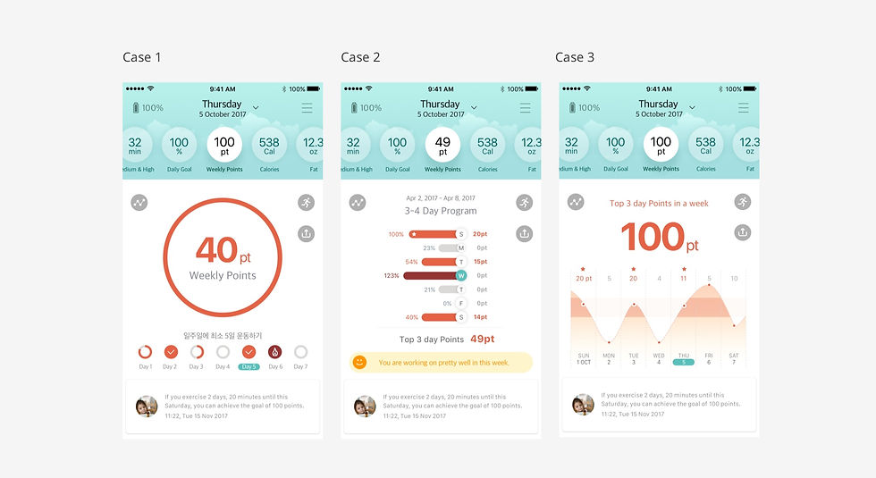
Graphic study of weekly workout
We used weekly-based data to visualize the users’ lifestyle. We thought this was the simplest way to deliver the health message and motivate them to work out regularly. The weekly chart needed to effectively communicate when they made progress toward their fitness goals and when they did not. I came up with a weekly chart with easy-to-follow check boxes and created a 100-point scoring system based on the number of boxes checked. Several mockups were created for every single page to compare which one worked best.

Study of sleep graphs
The essential functions of the sleep monitoring graphic were to convey how much users woke up during the night and classify sleep time as either deep or light. Bar graphs require time to read and understand because of their x and y axes. To make them easy readable, I used a color classification system. Wake-up times are a critical variable for sleep quality, they were colored most vividly to alert users to their importance.

Heart rates graph and UI for wearable device
Heart rate devices require more caution to convey important messages since these messages can be critical to one’s health. Of those displayed, the graphic of beats per minute and the heart rate trend are most important to overall health status. Therefore these points were displayed most vividly to alert the user.
